


It is no secret that I love white and neutrals. I lathered the interior of my house in Dulux 'Antique White USA', from top to bottom. It is such a perfect warm white that complements everything I love... timber floors, neutral slip-covered sofas, natural stone, white French doors and silver/rattan accessories.
I must admit I have been itching to learn more about colour so when I had the opportunity to spend some time with the lovely 'Setty Vang', a Dulux Colour Consultant, last week, I jumped at the chance.
Setty discussed what is involved in a Dulux Colour Consult and how the most important thing is getting a good brief from the client. As Setty is a qualified Interior Designer, she takes into account the whole vision of the client's project... the layout of the home, lighting, floor coverings, planned accessories.... before even discussing colour. Choosing colour is all about creating ambience. It can enlarge or reduce spaces, reflect more light and create mood and illusions.

Hmmm, major mood!
I pounced on Setty's colour book as soon she got it out and went straight to the neutrals as I was so keen to hear her take on the 'wonderful world of whites'.
Cooler whites, those with blue/green undertones, tend to suit more modern contemporary homes, with lots of light and modern reflective surfaces, whereas the warmer whites (with cream, yellow and pink undertones), tend to suit a more traditional aesthetic, with possibly lower lighting and more warm finishes like timber and stone.
It was great to be able to look at large A4 sized swatches of colour and see the difference in their undertones. The larger swatches, available through a consultant, are not printed colour but actual "brushouts"... real paint.... so they are as accurate as accurate.
What works? What doesn't work? I wandered around with the large swatches, holding them up against accessories seeing how the colour took on a different life when up against various materials... timber, rattan, linen, silver. It all goes to show that paint colour choice needs to be done in your home, 'at the scene', in the light that you are going to be living in, surrounded by the things that you are going to be living with.
Case Study. I'm a sucker for a good case study.
Remember this place?....
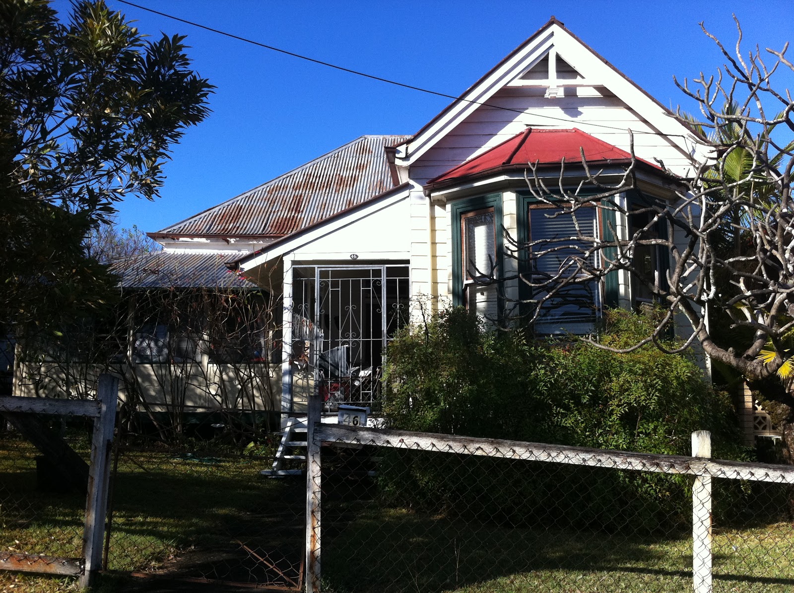
....from one of my posts last week?
Well Setty and I 'duluxed' up this place like there was no tomorrow.

We chose 'Stepney' Grey for the exterior. In the sun it 'throws' a mauve... and in the shade it 'throws' green. I held the large 'Stepney' swatch up to the exterior of my place, in the sun, against another grey I loved, 'Timeless Grey', which has a green undertone. You could really see the mauve tinge in the 'Stepney', in the sunlight.

Setty says, it is important to look at the whole picture, the whole home, when choosing an exterior colour as it has to complement the colour transition indoors. As much as I love the slightly greenish 'Timeless Grey', Setty pointed out that the subtly mauve-based 'Stepney' transitions better with my penchant for warm furnishings and my choice of interior paint, the mauve/slightly pink-based 'Antique White USA'. Both the grey exterior paint choice and the white interior paint choice have a mauve undertone and transition well together.
Setty informed me that "Grey Is The New Brown". I'm so glad to hear that I am keeping up with the trends. Apparently the 'Lattes' were the last biggest thing and now grey is it!

With choosing the exterior and interior white trims, on our 'Case Study House', we looked at either 'Vivid White'... the whitest of whites... or 'Lexicon 1/4' (which I used on the house). Despite the Lexicon having blue undertones, at 1/4 strength you can't really see much blue at all and it still complements even my mauve-based choices of 'Stepney' and 'Antique White USA'. As the 'Case Study Home' might not have the best light and might be a bit dark inside, the very blue-based whites, such as full strength 'Lexicon', would be too murky and dull for the lighting.
It was so interesting dissecting all the whites. See how the 'Peplum' has a slightly mauve base and 'Natural White', 'Whisper White' and 'China White' all have green undertones? I learnt so much!
Exciting blog news..... Dulux has kindly offered one of my Australian readers a session with a Dulux Colour Consultant, anywhere in Australia! If you are here in Brisbane, you might be lucky enough to win a session with Setty. She's so much fun and has been doing this for 16 years! .... a colour pro!
All you have to do is answer the question, "What Dulux colour would you choose to repaint one of your rooms and why?"
Just leave your answers in the comment section under this post and I will draw a winner on Friday the 14th of October, 2011.
To help you on your way with colours, there is a wonderful gallery of hues on the Dulux site HERE or go to their 'Colour Atlas' HERE if you are after the serious stuff!
Have fun!


ok
ReplyDelete