Pages

Subscribe:

Wednesday, January 30, 2008

From Planes to Furniture

Furniture designer Giancarlo de Astis designs wonderful furniture out of old airplane parts.

Il Cardine, a lamp from mahogony and an aircraft door hinge.

Il Sole, made of jet engine turbine blades and burl walnut. (The knights of the round table would have loved it!)

According to his website, Giancarlo earns his artistic license in the American West, where creative man-hours are embedded in the shapes of thousands of airplanes glimmering under intense heat awaiting their irrevocable meltdown in the desert bone yards of Arizona.

Similar to old prospectors spotting potential sites, Giancarlo delicately selects each airplane part that beams the brilliance of its engineered design.


A trip to the junkyard has never sounded so romantic!

Thanks to reader Gary for sending me these.

Tuesday, January 29, 2008

Build your own hidden door


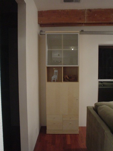
Remember this library with a secret powder room behind a bookshelf? I just ran across instructions for making something similar from off the shelf parts at Ikeahacker...


You'll have to play with the aesthetics a bit to make it steampunk styled, but the idea was too good not to share.

Redesign Your Blog #3: DEALING WITH PESKY HTML

First: PLEASE forgive me for not having continued this series until now. If I told you about my month of January, you would understand why I haven't blogged very much, but suffice it to say I have had a very busy and exhausting month.

Click to read PART ONE and PART TWO of the "Redesign Your Blog" series! This third and final post will deal with the html aspects of blog redesign, and will be fairly simple, as I'll try to just address the html issues you guys have asked about. At the end of the post, I've included a final list of all the links I've found helpful in doing my own blog redesigns.

***As I warned you before, please save your existing template in a word doc before you begin fiddling with it. Then you can play around all you want to and rest assured that if you mess it all up (which happens sometimes for us non-experts), you can go back to "normal" without any problems!***

BLOG BACKGROUND
In the last post (part two), we talked about some options for selecting a background design, or using a solid color for your background. Here is a great link that will show you how to use a background design and implement it into your blog design. It tells you specifically how to insert the saved graphic file into your template... If you'll scroll down, you'll see a headline that says "How to make an image repeat across the whole page (like wallpaper)"-- this section contains the exact instructions I followed to get this lovely brown graphic as a background on mine, so I know it works, at least in blogger format. Here's another how-to about backgrounds.

BLOG SIGNATURE
In the last post (part two), we also discussed how to design a nice little signature to wrap up each post you write. Blogging Basics 101 has a great post about how to add your blog signature into your html. This blog gives information about blogger, wordpress, and typepad, so check it out! It's very helpful and she tells you precisely how and where (in your html) to insert the file so that it will automatically show up on each post you write.

GENERAL TIPS ABOUT HTML
* Have fun trying out new colors using the html 6-digit color codes. Use the color thesaurus I've mentioned or your design program to select colors, and then play around with them-- there's a whole section of your html that controls the colors on your blog (background color, text colors, sidebar widget colors, etc.). You can play with these to your heart's content, and come up with some interesting combinations that will make your blog stand out. I think it's best and easiest to read a blog that has dark text with a white background... but you can play with yours and see what you like. The great thing about doing it yourself is that you don't have to stay committed to anything. If you don't like it, change it-- no harm, no foul!
* The more you play around (even in small ways) with your html, the more familiar you'll become with it. You'll start to notice patterns: how the lines end, how new sections are added in, what a widget portion of html looks like, etc. So keep looking at it, and as you increase your blog's visual appeal, you'll be adding to your own understanding of html. I've found this to be true, and I'll bet it will hold true for you too.

BLOG REDESIGN: HELPFUL LINKS

Finally, if there's something you want to know that I didn't answer here, you can always google it (of course), or check out Blogging Basics 101-- she has some great posts about design, html, graphics, and more. Hope this helps you put some finishing touches on the blog redesign you're doing... while this may not be comprehensive, I wanted to make it as simple and user-friendly (in non-expert language) as I could while still giving you the basics for a good redesign. I hope I've done that. If you have any big questions or see a huge gaping hole of something I didn't discuss, let me know- it may just be an oversight. (I've had the flu for over a week, had sick kids for 2 weeks before that, and just got a wisdom tooth pulled last night, so my body and mind aren't exactly working like normal!)

Blessings and Happy Blog Redesigning!

Monday, January 28, 2008

Mod My Fridge!


So if you were around last summer for the refrigerator posts, you may remember that I was leaning towards modding a panel front refrigerator as the most cost effective way to get a stylish fridge. After some regular Craigslist watching, $400, and the manual labor to haul it home 30 miles, I'm now the proud owner of a 5 year old, cabinet front, counter depth, GE fridge similar to this one.

So what's a steampunk homemaker to do with such a thing? It probably isn't the obvious first thing, but I've started by buying gauges on Ebay.

I liked the irony of having a heater gauge on a refrigerator.

This one is actually a working fridge thermometer -- if I get the probe sensor inside, I'll actually get the internal temperature on the outside.

This one is just a pressure gauge, easy to find on eBay.

Gauges for Milliamperes and Microamperes

Beyond the obvious "buy cool stuff" part of it, I think the actual first step is going to be finding/fitting/cutting some brass sheets to replace the cabinet fronts with.

I'm not the most artistic person, so I'm a bit worried about the whole "design something that looks good" aspect of this project. I'm taking inspiration from this Kohler ad, the Steampunk Treehouse, and Roger Wood's Klockwerks.

I'm soliciting ideas -- what else should I do with it? Do I go overboard and cover the entire front or should I take a more restrained approach? Any ideas for how to cover the black plastic of the water dispensor and the black handles that run the length of the doors? At this stage of the project, I'm open to any suggestion, no matter how crazy. Bring it on.

Have Republicans Lost Their Way? (And Other Political Musings...)

I've spent the last hour and a half poring over the fascinating international edition of Newsweek (the Jan. 28, '08), all about Bush's leadership and the declining influence of the Republican party over the last few years. One article in particular caught my interest and I want to share a portion of it and open up this issue for discussion here, if you're willing.

"The resentments of every group that has felt ignored are being taken out on the Republican candidates."

Excerpts from "How My Party Lost Its Way", by Michael Gerson, President Bush's former speechwriter:
As each one of them steps forward, ... he is greeted by ideological sniping. Mike Huckabee is targeted by free marketers... for his economic "liberalism". John McCain is attacked for his heresies on immigration and campaign finance reform. Rush Limbaugh argues that the nomination of either candidate would "destroy the Republican Party." Mitt Romney attempts to avoid this kind of criticism by blending in...with his surroundings-- a social conservative in Iowa, an agent of change in New Hampshire, a protector of the auto industry in Michigan-- and gets criticized (including by me) for his inconsistencies.

In this cycle, many Republicans seem led to support their candidate by the process of elimination--"I guess I could live with X." At the same time, many Republicans seem led to oppose candidates passionately-- "The nomination of X would end Western civilization." This is a factionalism of Bolshevik fervor, and it is a bad sign. Parties that prefer purity to victory-- a la Goldwater and McGovern-- usually lose. At this moment, Republicans look like the party that wants to lose the most.
The first bolded sentence is interesting to me, because right now, I actually feel this way. Course, I'm passionate about Huckabee as the best contender for President, as probably all of you know. But there is one candidate left that stands a chance that I believe I absolutely could not support (and that's Romney- because I don't believe his change of heart about abortion. There are too many inconsistencies, too late in life, for me to believe that his conversion is about anything but political expediency). So,

Question #1 is this: Have you experienced this kind of vicious dislike for a major presidential contender (you don't have to even share who it's against-- I'd just be interested in how many people actually have felt this kind of emotion/passion
against a candidate!)?

The second bolded section, though, worries me... so,

Question #2 is: Do you think the Republican party is too fractured to mend the wounds (economic free marketers vs. evangelicals vs. libertarians vs. hawkish Republicans, etc.) and is doomed to lose in November 2008?


Gerson then finishes his article with an insightful point, which I believe has merit:
...[T]here is, perhaps, one large American political figure who could cause depressed, fractious Republicans to bind their wounds, downplay their divisions, renew their purpose, and join hands in blissful unity at the Minneapolis-St.Paul Republican convention.

And that figure is Hillary Clinton.

So,

Question #3 is: What do you think about this last excerpt? Do you think Hillary-hatred is strong enough to unite people around even candidates that they have developed strong distaste for (during the primaries)? Is Hillary-hatred enough to revive a weakened Republican base and cause them to unite around a less-than-perfectly-pleasing-in-every-way candidate?

More personally, if you have a particular Republican candidate that you strongly dislike, can you project yourself into the future and consider if you could possibly support that person if it was a two-person X vs. Hillary race?

Your thoughts and comments are welcomed and encouraged... dialogue with me here about this!

Saturday, January 26, 2008

On Heaters and Radiators

Here's some heat related goodness to warm you up this winter.

Reader Joe Kesselman sent me a link to a Turkish company, Carisa, who is making hot water radiators in some very unique shapes. Unfortunately, all are chromed stainless steel and not warm steampunk metals, but they do have some clever designs.

The pipe organ style is the cleverest:
In only slightly related news, reader Paul Hulbert sent me this device from the South Western Electricity Historical Society in Bristol, UK.


My first guess was that it was a 1960s mod of a Victorian device, but it turns out I was wrong -- the extremely modern looking innards are just as Victorian as it's outtards.

This type of heater was available around the turn of the (19th!) century. This Apollo "Dowsing Sausage" Fire dates from approximately 1910. My friend and former colleague John Heath of the SWEHS explains that:

The electric filament lamp was considered inefficient because far more energy was converted into heat than produced light.

H. J. Dowsing, in 1896, designed a "heating lamp" with a frosted glass envelope. It had a 250 watt carbon filament which gave off no light except a warm red glow.

These were the first practical electric radiant heaters.

The Cannon bulb fire in 1904 had four of the "Dowsing Sausages" set against a polished reflector and controlled by brass switches.

The Apollo fire in the museum is similar.


Anyone visited the SWEHS in Bristol? It sounds like a lovely place!

Thank you Paul and Joe (and John!) for sharing these with us.

Voddie: Two Options For Parents

I was listening to a Voddie Baucham sermon the other day from this website (I can't remember which one now), and I came across this, and had to rewind it and re-listen about 85 times to be able to type out the exact quote, but I wanted to have it on paper to remember.

He's talking about the legacy we'll leave behind as parents... what we'll have done or accomplished in our lifetimes. I hope it challenges you like it did me.

"When I get outta here, there could be a couple of ways that I go.

Way number one? I could leave here saying, “I got mine. I got it all. My philosophy was, ‘get all you can, can all you get.’ And I got it! I’m there! I came, I saw, I conquered! It was AWESOME!”

Here’s the other possibility: My wife and I invest our lives in a relationship that is an illustration of the relationship with Jesus Christ and His church, and do the best that we can to spend the rest of our days together, bringing glory and honor to the Lord Jesus Christ through the way that we love, respect, honor, and cherish one another. And then, at the end of our lives, when we breathe our last, we will have raised a mob of children who have been brought up in the nurture and admonition of the Lord, so that when the adversary sees me breathe my last, he does not say “phew! Don’t have to worry about that one anymore!”

Uh-uh… when I breathe my last, the adversary will see a MOB of godly children crawling over mom and dad, moving the line forward, further than I ever could have in my own life, with my own limited resources. So that when it’s all said and done, it’s not about ME and what I experienced… it’s not about ME and how satisfied I was with what I accumulated and acquired, but it is about a godly heritage and godly legacy that has been left behind because we grasped and understood and walked in the design of this thing that we call marriage. THAT’s what I’m choosing.


So, that challenges me to ask myself, "what am I choosing? Today? This year? What am I choosing for our marriage, for our family, for our children? What am I choosing to be and pour into my husband and into my children? What and who am I going to leave behind to continue this unseen battle against the enemy? Am I living out this kind of life-purpose perspective in my actions today?"

Any thoughts?

Friday, January 25, 2008

Are you an Alchemist?

I was struck by Dylan Kehde Roelofs saying he was an alchemist -- a word that we don't use much anymore, even if we have the chops to back it up. It made me start thinking that perhaps I'm an alchemist, too!

Let's look at some examples that happen in my house:
  • turning milk into cheese
  • turning water and grain into beer
  • apple juice into hard cider

{I wonder -- does turning electricity into light count? }

It may not be as romantic as turning lead into gold, but I definitely think these sorts of projects qualify as alchemy.

Why am I even thinking about this? Steampunk is the intersection of the Maker movement with science fiction aesthetic and a revival of interest in the Victorian. Would it have gotten off the ground, and be gaining speed as quickly as it is, without physical goods made by hand by people like Jake von Slatt or Datamancer? Those first steampunk pieces thrilled us -- made us say "I want to be part of this! I want this to be part of my life." -- but without them we may not even of known that this thing called steampunk exists.

The struggle for me is in finding some level of "authenticity" within the steampunk home -- if all we do is buy stuff that looks good that's not exactly the spirit of steampunk (although patronizing artists is a noble cause not to be overlooked). Figuring out what you can make (or what lead you can turn into gold) -- with or without a neoVictorian spin -- can help inform your personal steampunk style. Into sewing? Why don't you make a desk from an old sewing machine table, or find some old sewing machine parts to use in a mantel still life or incorporate into a lamp or clock. If coffee is your thing, why not build a brass vacuum brewer? If it's something you have a passion for, you'll find learning about how people used to do it, and understanding the antique objects used to do it, brings a level of satisfaction and a depth of understanding that truly makes your home interesting and unique. (Our friends who visit only rarely always want a tour of our "Garage of Wonders" to get a glimpse into what the current projects and passions are -- and we love showing off our interests and indulging our love of lecturing.)

In our steampunk home, this means our interests tend toward the electrical or the alchemical. The electrical because we're both software engineers -- at it's most elemental the blinking of electrical signals and the moving around of ideas through the aether of the mind -- so gauges for the fridge that were used for measuring milliamperes and microamperes on some old piece of equipment brings a frisson of delight every time we look at them or the building of a mad scientist light reminds us of just how electrical circuits work.

This is a bit of a lecture laden departure from my normal sort of post, but at best it will give you something to ruminate on, and at worst you can just ignore it.

Dialogues between filament and bulb

Artist and glassblower Dylan Kehde Roelofs emailed me about his new collection of hand blown incandescent sculpture (also known as "light bulbs"). Rockets, insects, upside down bulbs, moon walkers -- the collection takes inspiration from a number of natural and industrial forms, while still maintaining a distinctive incandescent light bulb look.


The first question I had -- and all of you, too, I suspect -- is "what do you do when they burn out?" Dylan anticipated this and first takes us to task for focusing on a mundane practicality: The emphasis of these art objects is on their sculptural form and lighting quality, not quantity., before saying that you should be able to get somewhere between 100 and 1000 days out of them: This being said, the filament temperature is slightly lower than that of bulbs rated for 25,000 hours, and about the same as other famously long-lived bulbs. The filament thickness is at least 10 times that of a standard 2000 hour bulb. The initial inrush of current from being switched on, and vibration are the worst enemies of these sculptural filaments, since the rate of evaporation is several orders of magnitude lower that a standard bulb. Test bulbs approaching 2500 hours of age are not even beginning to show signs of darkening from this evaporation.


How does he make them? These are lampworked at an oxy-propane (hot!) torch from raw pyrex tubing stock. I do all of the filament winding and glass-to-metal seals on the tungsten (with uranium glass! Oh boy!) myself, as well as the vacuum processing.

I wondered where he got the sockets (or did he make those, too?!). Dylan says
I got the little sockets after begging to every lighting company in the book. Those sympathetic to the cause of Mad Science are occasionally willing to send 'samples'.

It's taken Dylan years to acquire the knowledge to build these. He is a Mad Scientist by career, a daguerreotypist, and, unlike the rest of us (who merely want to be), he actually is an alchemist -- he makes 16th century glass distillation equipment and uses it!

Thanks for sharing these with us, Dylan, and for answering my inquiries. I'm looking forward to what you do next!

Thursday, January 24, 2008

Steampunk Treehouse Tour

Boing Boing TV has a wonderful tour of the Steampunk Treehouse up today. According to one of the creators, it's "what a tree would look like if built by people who had never seen one"


Make sure you watch it through -- the interior shots (I adore the occuli!) are in the second half.

Xeni visits the Steampunk Tree House, a 40+-foot-tall interactive sculpture created by a group of artists in Oakland, CA, and assembled for the first time at Burning Man. More than 60 people helped to create it, and in today's episode, you'll hear from project participants Alan Rorie, Nathaniel Taylor, and David Shulman.

Some design details to watch for:
  • Iron (or possibly steel?) scrollwork over the door
  • Valve as a flower face
  • What feel to me like doorbell surrounds used a miniature frames
  • The steam whistle levers remind me of the gear shift in my Dad's dump trucks.
  • I love the warning sign: "Please operate the trioperator Delicately. It may Explode" in a genteel script, at an cock-eyed angle.
  • The demilune iron balcony is lovely

Original post on Boing Boing TV.

Dr. Kim's "Office"

It all happened by accident... (Vices always do, don't they?) Dr. Kim was buying a sound booth from an elderly doctor friend.


When I arrived at his office to pick up the booth, he gave me a lot of the big, basic pieces. The vintage medical pieces were his and his father's (who was also a physician - and was, in fact, a patient of Sigmund Freud!) Almost everything works, the otoscopes light up, and the rolling cart has a working suction pump.


My students and friends found out I had the 'office' and started to contribute a lot of the other pieces including the stainless bedpans, old books, and signs. One friend just donated a (non-functional) X-Ray machine just last year. Who knew there was so much old medical stuff out there?!


The wooden medicine cabinet has a lot of patent/chinese medicines and cures donated by friends.


While I wasn't sure I wanted to know, but I asked the good doctor what he did in this lab.

It doesn't really have a practical application now, although I did use it as a 'lab' for doing makeup and visual F/X for a while; It's pretty much just an "art installation" at this point (I'm sorry to say: I'm not really a mad scientist...) although there will be a film being shot in it later this year; and it's been a set for various other shoots in the past.


He also had some advice (he is a professional F/X person, after all) on getting some of these effects in your own lab/workshop/home:

I would describe the paint as: "an industrial green, that was sunk with the Titanic, and then recovered." The running rust on the walls was done by daubing brown on the green base, and then spraying lightly with water so the brown paint would run down. As I add the wall mount items, I position them to match the position of the stains.

The frames of the windows and door were painted with a metallic base and then layered with an oxidizer used to create real rust. The rusty medicine cabinet was actually a new galvanized piece from Ikea, also sprayed with the oxidizer to create the rust.


Incredible, isn't it? There's a couple more pictures on Dr. Kim's website.

Update: Dr. Kim sent along a panoramic view for our enjoyment. (Click to get a bigger version...)

From left to right you can see: my (all too modern) computer monitor; the vintage floor-standing medicine cabinet (filled with Asian cure-alls); the victims' 'table-of-doom'; the 'rusty' medicine cabinet; otoscope; the rolling 'suction' cabinet; vintage "Vornado" fan; phone; hydraulic chair; radium storage (glows green in the dark!); antique books and bedpan/urinal set (above); and above the clock, you can see a tiny picture of the two original doctors, as well as a framed photographic diptych of Dr. Freud.

Tuesday, January 22, 2008

Riveted Coffee Table


Just ran across this table on the website of French antique company le Grenier.

You have to inquire for a price, and it's in France. Lots of other interesting things on their website.

Thanks to Apartment Therapy for pointing out le Grenier.

Steampunk Range Hoods from Archive Designs

Ran across these range hoods by Archive Designs in a magazine yesterday.


Hammered nickel and distressed steel... it reminds me of an iron foundry (or something that would be in Lord Iron's house in Michael Moorcock's Silverheart)

He has a number of other interesting designs.

Some very industrial looking...
Beaten iron with hammered brass straps and rivets.

Others a bit more rustic...
Hammered copper with forged steel straps.

I really like this look -- trying to do something similar would be great for a fridge (more on that soon!), or a wall.

The site also has fireplace doors and screens, mailboxes, switchplates, and more fun things, but these were the most steampunk looking of the bunch.

Show & Tell: Whatever is on My Mind...

This may be the most random and lengthy "Show and Tell" in Making Home history, but I'm trying to do a brain dump and clear out my bookmarks. So, you all are the beneficiaries of my desire to downsize my bookmark folders. :)

MIKE HUCKABEE/PRESIDENTIAL RACE 2008
Conservative Talk Radio, Journalists and "Conservative Leaders"
Clearly, these guys didn't predict anywhere close to what has happened. Giuliani and Thompson were supposed to be slugging it out right about now. And both are near the bottom of every poll and primary. The most interesting campaigns are those that have come out of nowhere: Huckabee- no one saw him coming; McCain- remember all the articles in the summer and fall about him flying solo to events because he was out of campaign funds?; and Paul- the "fringe" candidate who has raised tons of cash. Though there's still no clear winner (the next two weeks will be interesting, though), one thing is clear: the media got it wrong. And the conservative media is still waging war against all the guys that the Republican voters actually like. Here are some articles you may want to check out, if this is interesting to you.

ABORTION
THE ROLE OF WOMEN?
HOMESCHOOLING: THREE EXCELLENT LINKS

DATING/PREPARING FOR MARRIAGE
  • Should young women take time to prepare for marriage?
  • The Bayly brothers offer sage advice for fathers with adult daughters:
    Yes we are to protect... It's our God-given duty. But protection begins at birth, not puberty. Training begins before our daughters can speak, not when they're giving their hearts to a man.

    ...Yes, we have a duty to counsel--and ultimately to give her hand in marriage. But if we suddenly stand and act as men only at the point of romance, when our daughters' hearts are being claimed by others, it's too little too late. The cows are already in the pasture, there's no sense rushing to close the gate.

CELEBRATING WITH FRIENDS
  • Congrats to my friend, Renee, on the adoption of her two sons from Ghana! I'll share two posts with you that have touched my heart as they've brought these boys into their family: FIRSTS- all the things her new sons are experiencing for the first time; and SIMPLE ADJUSTMENTS- some other insights into adjusting to one another in adoption.
  • Congrats to my friend, EmmyJ, on her continuing weight loss! Check out this post with all her "goals" and her progress so far... it's inspiring!

ODDS AND ENDS

And then, a little humor-- well, this is funny to me, anyway:

Amy writes, "Why I Write in Generalizations".

[Personal note: I am constantly amazed (and I'll admit, sometimes irritated) at people who come onto my blog and then make it their mission to comment about posts that don't apply to them... and harangue me for not making every post all-inclusive to everyone who might read it. Sometimes I want to say, "if you're against everything that has to do with being a biblical Christian woman, then why are you reading my blog?" Or simply, "I don't have time to list all the possible exceptions to every biblical ideal/principle in every post that I write." Amy handled it much better than me. ] :)

Blessings to you all and HAPPY READING!!!

Monday, January 21, 2008

Ecclesiastes 5:19-20

A friend sent this to me, and I wanted to share it with you... these verses have big implications for us as children of God, as women, as wives, and as moms. Hope it will encourage you as it does me!

"To enjoy your work and to accept your lot in life-- that is indeed a gift from God. The person who does that will not need to look back with sorrow to his past, for God gives him joy." ~Ecclesiastes 5:19-20, Living Bible

Saturday, January 19, 2008

Library and Air Ship of Genomo


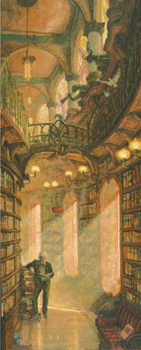
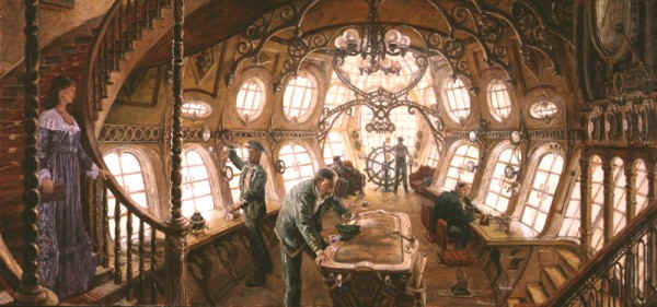
Found via a link by Angelus on the steamfashion community, these lovely paintings by Tom Kidd of Genomo -- a "a state of mind, a craving for adventure, the need to travel into unknown territory just to see what is there, the desire to have new experiences and to work with great people – maybe, even, dare to be great yourself. "

There are lots of paintings on the website, but these are two of the most appealing interiors. To the left is Peale's library:
With the early morning light sparkling against his marble floor, deep in his musty library, with gargoyles perched above and shelves of books packed tightly below Charles Wilson Peale III searches through documents....


There's also the navigation gondola of HMAS Wyeth. It reminds me of Paris, in an Eiffel Tower/Metro Station iron work sort of way.


Related: Airship Fantasy Room

You Are In The Presence Of Royalty

Hey everyone! Check out my new title! I saw this on one of my new favs White Cottage Memoirs.


My Peculiar Aristocratic Title is:
Imperial Majesty Shelley the Elegant of Fritterton on the Marshes
Get your Peculiar Aristocratic Title


You too can become a "royal". Just click on the link and follow the instructions. Before you know it we'll all be sticking our pinky out at tea!

Ta Ta!

Shelley The Elegant

Design notes on The Golden Compass

Jordan College

I finally saw The Golden Compass last week, and would describe it as "beautiful with moments of trite." (But then, I'm not the biggest Philip Pullman fan, petering out somewhere in the middle of The Subtle Knife.) Since this blog is all about how things look, however, I definitely think it's worth a viewing since the sets were fantastic.

Lord Asriel's Study

What I really liked was how the sets managed to blend styles from multiple eras -- Gothic at Jordan College, Art Deco at Mrs. Coulter's house, an old west feel in Trollesund, and then an almost 1960s lab in Bolvangar.

Mrs. Coulter's

Production designer Dennis Gassner is quoted at About.com on how he created the look: This will be the turn of the century to the '40s. We have that window of 40 years to say…' For costume, for props, everybody needed to have a window in time to deal with. But it's a broad window of time. We're dealing with a generality and that opened things up. It's much more fun for the audience to look at because it is a fantasy, even though we're basing it in a reality environment. We're saying, 'This is a real time, real place that you're in now.' But it gave me the scope to play with a lot of elements of time. And that accumulation is the exciting part about getting to do something like this.”

Jordan College

He calls it "cludging. It's taking one element that exists and another element that exists and putting them together, combining into something else.” A very steampunk perspective, no?

I had also read that he based his aesthetic for the movie on the circle.


Trollesund

Actually, I learn from the interview with Gassner, is that it's a bit more complicated.

“The question that I had for everybody was what is The Golden Compass? And to me, I deal in symbols, I'm the architect of the film. How do you get into a world like this which is a very unusual world, one that I haven't created and nobody has? So you start with that, something simple,” explained Gassner. “The simplicity for me was actually the sphere which became the golden compass. The protagonist and the antagonist of our films, you need symbols, simply become that. The symbol for purity for Lyra and then the antithesis of that would be for me the oval, which is the extension or manifestation of that symbol. So it's nice to have a contrast, and you can start to build the world from there. That's how I started, very simply and very direct.
Bolvangar

Both of these ideas -- design inspirations that span 40 years, the circle as a recurring design element -- are ones that you can incorporate into your own home. My own home, which is slowly becoming more and more steampunk, has elements drawn from Victorian, Art Nouveau and Art Deco fraternizing quite nicely together. I also use the circle -- a very steampunk shape -- in many of my home accessories -- mirrors, a large copper bowls on the dining table, etc.


Ugo has a video about steampunk and the look of the movie.
Ugo's Gallery
About.com's Gallery
IMDB's Photos

Friday, January 18, 2008

Gothic Glow: Steampunk Lighting for your Home


Reader Barry Berman recently wrote to me. Inspired by the post on Mad Scientist lamps (mine is still in progress, the gods of procrastination and interruption have gotten in the way...) he decided to build one out of parts he had laying around. He showed it off to his coworkers, they encouraged him to build more and make them available for sale... So here they are!

Gothic Glow has models in 2, 6 or 12 bulbs, available in limited quantities.


This is definitely a labor of love for Barry:

I ... scrape, grind and sand portions of the box to have rounded edges, and so the parts fit inside. I buy the brass plate, cut all the plates by hand, and hand stamp a drilling pattern for the lamps and screws. Afterwards, I stain the boxes with two different stains, one red and one brown. Then I electrolytically etch the brass using the toner transfer method, before doing the final assembly and hooking up all the parts.


The skull dimmer is a knob made for guitars by Q-Parts. I've been experimenting with making my own knobs though too. And being the crazy person I am, I'm melting the brass pouring them into bat shaped molds. You have no idea how cool molten metal is!

I think we'll hear more from Barry, since he's since started on other steampunk projects like electric violins and phonograph players and will add them to gothic glow if there is enough interest. (And molten brass! How great would that be -- how about doing a line of gear shaped knobs for projects like this, or drawers or cabinets, Barry?)

Are you working on anything appropriate for a steampunk home? If so, let me know -- I'd love to feature more project like this one. Have skills but no inspiration? A while back I suggested (space) ships in a bottle or plates with steampunk diagrams on them (kilned or decoupage...).

Something to Ask Ourselves...

As I was out of town over the last couple of weeks, I was challenged by something that I want to pass along to you.

As women, in this increasingly competitive, success-driven, comparative world, we are often tempted to measure ourselves by what we DO. Whether single or married, with or without kids, in a career or not, or in whatever hobbies we choose, we often measure the relative success or failure of a day, week, or even year by what we have DONE, and what we have accomplished. Even among stay-at-home-moms, there are often "levels" of success that we may feel compelled to live up to.

A few examples:
  • "I got three loads of laundry done today while chasing after my toddler! Well done, mama!"
  • "I finished the report that the boss needs for next week."
  • "I made it through a whole week cooking for my family without falling back on fast food."
  • "I exercised 3 days this week."
  • "I beautifully scrapbooked my child's first eightteen months of life."
  • "I read through the Bible this year."
  • and on and on and on...
We can sometimes tend to measure how well our days, weeks, or years go (and by extension, judge ourselves) by what we do.

But here's the thing that challenged me, that I hope will challenge you as well:

Instead of asking ourselves, "what am I going to DO today?",
we should be asking, "who am I going to
BE today?"

And set our goals accordingly!

For example:
  • I'm going to be a respectful and happy wife to my husband.
  • I'm going to be a woman who meditates on the Word of God daily.
  • I'm going to be a responsive and affectionate mother for my child(ren).
  • I'm going to be a diligent student.
  • I'm going to be a woman who offers grace instead of judgment to the people around me.
  • I'm going to work efficiently (as unto the Lord) on what needs to be done at work/home today.
  • I'm going to be a woman of prayer, lifting up concerns throughout the day to God.
  • and on and on and on.

Does this shift in thinking help you as much as it helps me? I hope so! It helps me to think of the kind of character I want to have (which will then translate into the actions I choose), rather than focusing on the actions themselves. And of course, none of it is possible on our own. We can't "muster up" a gracious spirit or a responsive attitude, at least not consistently. But we CAN be any and all of these things when we are prayerfully submitted to God as women.

Let me know what you think, and if this new question/way to evaluate ourselves is helpful for you.

Thursday, January 17, 2008

Six Degrees Of Kevin Bacon

Lately I have found out just how small the world I live in is. This post isn't really about Kevin Bacon, but I couldn't resist using this phenomenom as a tongue in cheek comparison to my new friend Theresa Cano. Now if you aren't familiar with The Six Degrees of Kevin Bacon just google that expression and you'll get my point. Anyway~~I have come to know Theresa Cano through the world of blogging and hers is my favorite because she is like a world class reporter on the subject of junkin'. Not to mention that she's just a downright nice person.

Well after emails and commenting on each others blogs, I find out she knows Theresa Smith of Cottage Gardens in Kentucky. If you will remember, Theresa's fab house was recently featured in Country Living and I had kept the article before I even knew either of them. So, this past weekend on my way home from the mart in Atlanta I dropped in on my pal Deb Orrick at Exit 109 Antiques in Vienna Ga. and find out she knows Theresa and Craig Smith from Scott Antique Market in Atlanta and also French Vanilla~~wonderful dealers who do the Marburger Farms show at Round Top. I feel positive that Theresa Cano knows the French Vanilla dealers as she always shows us great pics when they are at a show there. So you can see how all this got me thinking about Kevin Bacon... Maybe we didn't quite make six degrees but you have to admit it is a small world afterall. Hmmmm.......

Blessings!

Shelley

Wednesday, January 16, 2008

Chemical Appeal at CB2


One of the few places the pervasive "modern" style intersects with steampunk is in laboratory style (the other one is industrial, as we've recently seen). This means you can occasionally uncover affordable steampunk treasures in mass market home goods retailers.

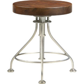
I've mentioned CB2 before, and I recently perused their newest catalog. In addition to the beaker glass vases I have in my house, they've added some wine decanters in the shape of a volumetric flask. (Want the real thing? Indigo has some, but they're $20 compared to CB2's $15.)


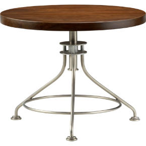
The biggest surprise, however, is the Alchemy side table and stools. The Alchemy is a nice dark wood table top over a matte stainless steel lab stool bottom. The side table seems stuck at 20 1/4 inches high, but the stools are adjustable (I believe by spinning!) from 15 1/4 to 10 1/2 inches high. I just wish they made a small dinner table sized one I could use in my breakfast room.


The Victorian chemistry lab look has a lot of appeal -- the dark woods and clean lines work for a less fussy style than traditional Victorian interiors, or would be a good way to add some steampunk style to a transitional, modern, or eclectic home.

More science style.

Tuesday, January 15, 2008

Mr. von Slatt's Victorian RV


Mr. von Slatt (yes, that von Slatt) recently posted some pictures and a video of a school bus he converted to a Victorian styled recreational vehicle.

I was trying for a Victorian look in my design, I wanted something that had the feel of a sea coast summer house that had been in the family for generations. Something bright, light, and simple but with an air of country elegance. All within the constraints of material I found or was given.

My favorite is the kitchen, with blue greens similar to the interior paint of the typical school bus.


There's a whole video on how he did the conversion -- it's very interesting!

According to Jake's video, people ask: "Why would you do this?" His answer -- the best one -- "I love to build things!"

Weary Traveler

This past weekend, Mr. Sweet Pea and I travelled to Atlanta to turbo through what we could at the Atlantasmart market for retailers. Why do I say turbo? Because while most buyers spend the better part of a week there, we had two short days to power through! If you've ever been, you can appreciate what a challenge it is. Floor after floor of product, and honestly a whole lot of it looks alike and most of it doesn't belong in my shop. But I was in need of some new vendors and so off we went. I did find, I am happy to report, several new lines that I have ordered and am eagerly anticipating their arrival. So all you loyal Sweet Pea customers (you know who you are) and those who haven't been in for awhile~~get ready for some fab new stuff!

I also had the pleasure of joining a dinner for shop owners organized by Debbie Dusenberry of the infamous Curious Sofa at a charming little restaurant called the Pleasant Peasant. It was invaluable to meet and network with other shop owner's from all over the country, and hats off to Debbie for putting it together. Many of us read each others blogs also and it was nice to put a face with a name. Great fun!

Lastly, I hope you have noticed that my blog has been given a wonderfully charming face-lift! I have been checking out so many other blogs that are so fantastically designed, and being techno~challenged as I am I needed some help to make mine equally as fun. So, I contacted the very talented Sara Duckett at Sadie Olive to work her magic on my blog. She does web design as well and that may be next on the horizon for me. She is really easy to work with and as you can see she's way talented!! Thanks Sara!

Until next time, stay well and keep living the creative life!

Shelley

Monday, January 14, 2008

Ceiling Fans!


Reader Jon was so kind as to recommend a very clever ceiling fan. The Air Shadow is a ceiling fan whose blades retract when not in use. Sort of like a transformer, except for grown ups.

I like the idea, both from a "clever gadget" perspective, but also because it doesn't take up the visual space in a room a traditional ceiling fan does.

The other find from Jon? The site he found the Air Shadow on is Fanimation, which has some of the most fabulous fans I have ever seen.

Have you ever wanted multiple ceiling fans belted together, like they have a Dave and Buster's? Check out the Brewmaster.


Have an extremely high ceiling and want to fill the space to make the room more cozy? I'd say the American is your fan.


Perhaps something more evocative of a hovering airship?


What fun! There's lots more on the Fanimation site (and be sure to check out their gallery).

Other fans.
Related Posts Plugin for WordPress, Blogger...