Pages

Subscribe:

Monday, October 3, 2011

Makeover Monday: 'Life Is Beauty Full' Sign


One of my favorite things to do is giving new life to furniture and decor for my home. What great satisfaction I get from making something from ugly and plain to something fun!

Each Monday this Month, I'll feature a makeover I whipped up. I try my very best to use what I have at home when it comes to the makeover. There is always leftover paint, wood and trim from past projects that I have stored away for projects like these.

I'm excited to show you what I did over the weekend. I created this fun sign with one of my favorite sayings.

"LIFE IS BEAUTY FULL"


It was so simple to make!

All you need is:
Piece of wood
MinWax Dark Walnut Stain
Craft Paint
Painters Tape
Stencil Brush
Stencils
Tape Measure
Pencil

Let's go over the steps!

I had this old sign that I didn't care for anymore. So I flipped it over and removed the sawtooth hanger off the back.


The wood was already nice and smooth, so it needed no prep work.

I wanted to create the look of planks on the one piece of wood. 

Now you can easily create a wood plank sign instead. Just head over to my easy tutorial on making a wood plank picture holder.

To create the look of planks, I decided to paint horizontal lines using painter's tape. I love painter's tape, I use it for everything!

So I measured 4 equal parts, for each word of my quote. I wanted each word to be the focus of each "plank".
My planks happened to be 5 1/4'' wide each but it all depends on the size of your board. So this measurement will vary to your taste and size of your piece of wood.


Then I placed a piece of tape at each marking. I don't like to mess with pencil marks so very small marks are only necessary.


Then I placed another piece of tape next to the existing pieces. I did no measuring on this step. I just allowed a small gap between the 2 pieces of tape.


Then I painted in between the 2 pieces of tape with dark brown craft paint.


I pulled off the painter's tape and now I have 3 lines with 4 sections for each word of my quote.


Now this is where you can do a couple options. You can either use paint or vinyl for your sign. You can create wonderful designs and words from your personal cricut or silhouette.

I don't have either so I used craft paint to first free hand a design inspired by a pattern I found on the Internet. It's not perfect. But that's okay because I'll be sanding and staining the piece later to hide the imperfections. But I like imperfections. :) I used a color called "seamist". I only painted this design on one section of my sign.


I already had some alphabet stencils. So I went ahead and stenciled each word with black craft paint to each section.


I used the painter's tape to keep my letters straight. I don't like to measure and mess with pencil marks.


After the paint was dry, I sanded down the wood to give the letters and design a little distressed look. Then I added MinWax Dark Walnut Stain.


The stain really made the "seamist" color pop. The design is subtle enough to add that extra detail without overpowering the the message of the quote.


Now I have a fun and inspiring sign to add to my living room that I created for FREE!


Thanks for stopping by. Be sure to come back tomorrow to link up to Terrific Under Ten Tuesday! A fun linky party for projects and fun finds for $10 or less!

Linking up HERE.

DIY Club


Sunday, October 2, 2011

There's White And Then There's White


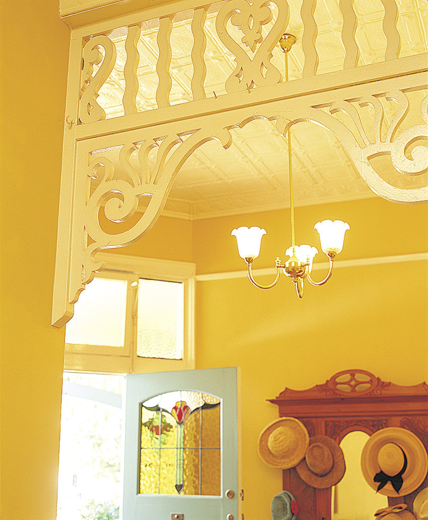
It is no secret that I love white and neutrals. I lathered the interior of my house in Dulux 'Antique White USA', from top to bottom. It is such a perfect warm white that complements everything I love... timber floors, neutral slip-covered sofas, natural stone, white French doors and silver/rattan accessories.

I must admit I have been itching to learn more about colour so when I had the opportunity to spend some time with the lovely 'Setty Vang', a Dulux Colour Consultant, last week, I jumped at the chance.

Setty discussed what is involved in a Dulux Colour Consult and how the most important thing is getting a good brief from the client. As Setty is a qualified Interior Designer, she takes into account the whole vision of the client's project... the layout of the home, lighting, floor coverings, planned accessories.... before even discussing colour. Choosing colour is all about creating ambience. It can enlarge or reduce spaces, reflect more light and create mood and illusions.

Hmmm, major mood!

I pounced on Setty's colour book as soon she got it out and went straight to the neutrals as I was so keen to hear her take on the 'wonderful world of whites'.

Cooler whites, those with blue/green undertones, tend to suit more modern contemporary homes, with lots of light and modern reflective surfaces, whereas the warmer whites (with cream, yellow and pink undertones), tend to suit a more traditional aesthetic, with possibly lower lighting and more warm finishes like timber and stone.

It was great to be able to look at large A4 sized swatches of colour and see the difference in their undertones. The larger swatches, available through a consultant, are not printed colour but actual "brushouts"... real paint.... so they are as accurate as accurate.

What works? What doesn't work? I wandered around with the large swatches, holding them up against accessories seeing how the colour took on a different life when up against various materials... timber, rattan, linen, silver. It all goes to show that paint colour choice needs to be done in your home, 'at the scene', in the light that you are going to be living in, surrounded by the things that you are going to be living with.

Case Study. I'm a sucker for a good case study.

Remember this place?....


....from one of my posts last week?

Well Setty and I 'duluxed' up this place like there was no tomorrow.


We chose 'Stepney' Grey for the exterior. In the sun it 'throws' a mauve... and in the shade it 'throws' green. I held the large 'Stepney' swatch up to the exterior of my place, in the sun, against another grey I loved, 'Timeless Grey', which has a green undertone. You could really see the mauve tinge in the 'Stepney', in the sunlight.


Setty says, it is important to look at the whole picture, the whole home, when choosing an exterior colour as it has to complement the colour transition indoors. As much as I love the slightly greenish 'Timeless Grey', Setty pointed out that the subtly mauve-based 'Stepney' transitions better with my penchant for warm furnishings and my choice of interior paint, the mauve/slightly pink-based 'Antique White USA'. Both the grey exterior paint choice and the white interior paint choice have a mauve undertone and transition well together.

Setty informed me that "Grey Is The New Brown". I'm so glad to hear that I am keeping up with the trends. Apparently the 'Lattes' were the last biggest thing and now grey is it!


With choosing the exterior and interior white trims, on our 'Case Study House', we looked at either 'Vivid White'... the whitest of whites... or 'Lexicon 1/4' (which I used on the house). Despite the Lexicon having blue undertones, at 1/4 strength you can't really see much blue at all and it still complements even my mauve-based choices of 'Stepney' and 'Antique White USA'. As the 'Case Study Home' might not have the best light and might be a bit dark inside, the very blue-based whites, such as full strength 'Lexicon', would be too murky and dull for the lighting.

It was so interesting dissecting all the whites. See how the 'Peplum' has a slightly mauve base and 'Natural White', 'Whisper White' and 'China White' all have green undertones? I learnt so much!


We did discuss bolder colours... briefly. The general gist is that anything bolder is more likely to date. So I sort of changed the subject pronto. I'm a sucker for 'timeless' and needed to discuss whites more! Setty said that the whites and neutrals are the most popular colour range. They are ideal for creating a clean, classical backdrop which provides a good basis for adding your most favourite colours to any room.

Exciting blog news..... Dulux has kindly offered one of my Australian readers a session with a Dulux Colour Consultant, anywhere in Australia! If you are here in Brisbane, you might be lucky enough to win a session with Setty. She's so much fun and has been doing this for 16 years! .... a colour pro!

All you have to do is answer the question, "What Dulux colour would you choose to repaint one of your rooms and why?" 

Just leave your answers in the comment section under this post and I will draw a winner on Friday the 14th of October, 2011.

To help you on your way with colours, there is a wonderful gallery of hues on the Dulux site HERE or go to their 'Colour Atlas' HERE if you are after the serious stuff!

Have fun!
Photobucket

Menu - Week of October 2, 2011


October is finally here and in the Northeast we are really noticing the change in seasons. Leaves are falling along with the temps and much to my chagrin, it's getting dark much earlier these days. My camera and I are mourning the loss of natural light. I am also in full-on comfort food mode, as you will see in the menu plan below.

I'm also excited because next week is Baby Girl's second birthday, which we're celebrating on Saturday. Hard to believe two years have passed already. Where does the time go? And the day after her birthday is our 8th wedding anniversary. These two milestones truly mark the beginning of the fun and festive fall and holiday season for me and I can't wait.

Sunday - Salisbury Steak, Blue Cheese and Scallion Mashed Potatoes, Creamed Spinach

Monday - Goat Cheese, Sweet Onion, Apple and Brandy Stuffed Chicken, (for the recipe swap and I'm planning to modify it), oven roasted potatoes, corn

Tuesday - Gnocchi Mac and Cheese, side salads

Wednesday - Pan Seared Pork with Citrus Rum Sauce, mashed potatoes, green beans

Thursday - Ranch Pasta with Bacon, Spinach and Tomatoes

Friday - BBQ Cheddar Bacon Ranch Chicken Salad Wraps, chips

Saturday - pizza, antipasto and cake for Baby Girl's 2nd birthday party
Related Posts Plugin for WordPress, Blogger...