Pages

Subscribe:
Showing posts with label Paint. Show all posts

Friday, March 30, 2012

The Subject Of Colour


I had a rather exciting week last week. As well as buying a block of land for my next project, I got flown to Sydney by Taubmans, to take part in the 'Taubmans Great Colour Debate'. 

This was the floor of the venue. 
Wild.


I learnt lots about paint technology ("paint is not just about colour, but also technology") and that great paint that they use on 'Selling Houses Australia'.

I'd heard of it (Taubmans, 'Endure') but I'd never really investigated what made it different to any other paint. Being a scientist by trade, I was in geek heaven. I like things to be scientifically proven.... with reproducibility and stats thrown in for good measure. Choice loves it... as an 'overall best performer'... and the Asthma Foundation have labelled it a 'sensitive choice'. I'll leave a link HERE for you to read all about it's goodness, as this is not a sponsored post . This is just me telling you about my fabulous day.


So we were in this really groovy place... with fabulous lights, paint splattered floors, vibrant fresh flowers, rustic table settings....


.... and seriously heavenly food.


Shaynna Blaze, the interior designer from 'Selling Houses Australia' and the newest judge on 'The Block' (they DID listen to the viewers and bring in a female judge!), talked about how the general public has lost confidence in colour. We see all these fabulously, colourful makeovers on TV and in beautiful magazines... and blogs! ...but the biggest selling paint colours are still the neutrals.....whites, beiges, off whites. 

Why do we have such a fear of colour? (why do I have such a fear of colour?... I was asking myself quietly, hoping no-one would notice that my favoured aesthetic is a 'white washout'). Is it a hangover from the 70's and 80's...... mission brown, orange, yellow and bold patterns? Is it a fear of being judged? Is it a fear of failure? In the end it's just paint, you can paint over it. Yeah! I can vouch for that, painting over my 'royal blue' kitchen feature wall in the 90's to bring in the 'spiced apple'... oh those were the days! I used to love colour. What happened?

As Shaynna said, "we have been in a beige coma for way too long". The norm now is "layers of beige".

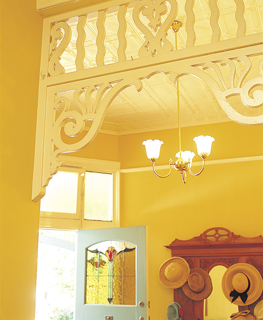
Shaynna made colour sound delicious and enticing, stating that "colour is like a complex woman. It's sassy, and moody, suggestive, manipulating, fun and nurturing". I didn't realise that colour names use such sensory words.....words that evoke such emotion... chocolate, latte, caramel, espresso. We link sentiment to colour. One participant told a story about a bright yellow room in her mother's home. The 'yellow room' was saved for all the special occasions... birthdays, Christmas, celebrations, happy times. You'll never guess what the participant's favourite colour was! She is planning a yellow room in her own home. Sentiment exactly.

So how do we progress on from neutrals? As Shaynna said.... "we experiment". It's ok to make mistakes. It's very low risk, very low cost. It's not failure. 

Nadine, from Taubmans, cited an interesting study that showed people who made a big mistake with colour in their home were more likely to live with it longer and not change it... compared to people who were happy with the colour in their home. The people who had made a good colour choice, and lived happily with it, were more likely to change their colours more often!


How cool is this? 
I digress. 

We discussed colour in small spaces.. as our homes are becoming smaller. It was suggested that you link your wall colour to your floor... and don't create blocks of colour.... block of couch, block of rug. Don't use jarring colours (opposites on colour wheel). Don't create levels of colour in a small space .... keep skirtings, architraves, cornices and walls in a similar colour, no more than 1/2 a shade away from each other.


I could feel a bit of a paradigm shift, sitting amongst all these colour advocates. You will see colour in my next place. Big statement, but true. Colour beyond the accessories. Colour on the walls. I'm going to 'put my brave on' and start with tints. You can hold me to that.


I was most impressed with my goodie bag. As I said my favourite colour was blue, I got the most rocking electric blue nail polish, which is going to go down so well in orchestra!.... and that tin of Endure paint?... full to the brim of M&M's. We've made a start!

Thank you Taubmans. I got to meet some of the other wonderful invitees ...... from Vogue Living, Burke's Backyard magazine, Domain, Indesign, News Limited, Dec PR and Taubmans and Shaynna Blaze of course.

I had a lovely, happy, colourful day!
Photobucket

Friday, December 2, 2011

The Perfect Grey and Prime Shed Real Estate


Isn't this the most perfect colour for this house?!!! I couldn't imagine it any other colour. The grey just makes the white and greenery pop. If I could get it this right, I would go dark grey next time. This is a beautiful home in the Northern Hemisphere (of course) photographed by Maria Killim, from Colour Me Happy Blog. 


Now, if I could just organise Dulux to do a colour match to 'Pratt and Lambert Wendigo' grey, I have my next house exterior colour sorted. Done. 

Ok, big day today. My shed leaks.... the shed where I work from for Cape Cod Designs. Even though it is on the ground floor and there is a unit above me, it leaks. Significantly. When it rains, the water finds a course from the roof of the complex, down metal beams and straight into my shed... and the poor guy's next to me. He has swimming pool size puddles. Often. I had a bookcase with every shelf filled with water...bye-bye 15 yr old wedding frock, bye-bye photo albums.... and lots of beautiful stock that I was saving up for a Christmas shopping post over at 'Cape Cod Designs'.... all ready to go. It's happened before. Twice. I have to save all the soggy stuff for the insurance company to view. I still have the stuff from the last leak.....  once beautiful cushions and throws growing mould and fascinating fungi, much to the boys scientific delight.


Prime Shed Real Estate. Doesn't get any better than this.

So.... I'm moving sheds. I am moving from 'prime shed real estate' (I had the best, most coveted position for a small business.... under cover, huge area in front to spread out and box up my lights, easy access for the forklift for my pallets, natural light) ... to a shed in a dark alleyway of sheds. Sigh. I'll have to get a super duper light. No more beautiful daylight to work by. Small blessing...this new shed is 0.5m wider though. That might not mean much to you but to someone with stock, it's luxury! .. and I have demanded the same price for it. 

Ok, so little one and I are going to make a start today. Big one is on a sleep over and was delighted to hear he would not be around to start the move! The blessings? I get to do a stocktake as I go......and I get to the back of the shed (where no person has gone before... well at least for a couple of years).....and I'll find my teacups!

Happy Saturday. I will report back tomorrow!
Photobucket

Sunday, October 2, 2011

There's White And Then There's White


It is no secret that I love white and neutrals. I lathered the interior of my house in Dulux 'Antique White USA', from top to bottom. It is such a perfect warm white that complements everything I love... timber floors, neutral slip-covered sofas, natural stone, white French doors and silver/rattan accessories.

I must admit I have been itching to learn more about colour so when I had the opportunity to spend some time with the lovely 'Setty Vang', a Dulux Colour Consultant, last week, I jumped at the chance.

Setty discussed what is involved in a Dulux Colour Consult and how the most important thing is getting a good brief from the client. As Setty is a qualified Interior Designer, she takes into account the whole vision of the client's project... the layout of the home, lighting, floor coverings, planned accessories.... before even discussing colour. Choosing colour is all about creating ambience. It can enlarge or reduce spaces, reflect more light and create mood and illusions.

Hmmm, major mood!

I pounced on Setty's colour book as soon she got it out and went straight to the neutrals as I was so keen to hear her take on the 'wonderful world of whites'.

Cooler whites, those with blue/green undertones, tend to suit more modern contemporary homes, with lots of light and modern reflective surfaces, whereas the warmer whites (with cream, yellow and pink undertones), tend to suit a more traditional aesthetic, with possibly lower lighting and more warm finishes like timber and stone.

It was great to be able to look at large A4 sized swatches of colour and see the difference in their undertones. The larger swatches, available through a consultant, are not printed colour but actual "brushouts"... real paint.... so they are as accurate as accurate.

What works? What doesn't work? I wandered around with the large swatches, holding them up against accessories seeing how the colour took on a different life when up against various materials... timber, rattan, linen, silver. It all goes to show that paint colour choice needs to be done in your home, 'at the scene', in the light that you are going to be living in, surrounded by the things that you are going to be living with.

Case Study. I'm a sucker for a good case study.

Remember this place?....


....from one of my posts last week?

Well Setty and I 'duluxed' up this place like there was no tomorrow.


We chose 'Stepney' Grey for the exterior. In the sun it 'throws' a mauve... and in the shade it 'throws' green. I held the large 'Stepney' swatch up to the exterior of my place, in the sun, against another grey I loved, 'Timeless Grey', which has a green undertone. You could really see the mauve tinge in the 'Stepney', in the sunlight.


Setty says, it is important to look at the whole picture, the whole home, when choosing an exterior colour as it has to complement the colour transition indoors. As much as I love the slightly greenish 'Timeless Grey', Setty pointed out that the subtly mauve-based 'Stepney' transitions better with my penchant for warm furnishings and my choice of interior paint, the mauve/slightly pink-based 'Antique White USA'. Both the grey exterior paint choice and the white interior paint choice have a mauve undertone and transition well together.

Setty informed me that "Grey Is The New Brown". I'm so glad to hear that I am keeping up with the trends. Apparently the 'Lattes' were the last biggest thing and now grey is it!


With choosing the exterior and interior white trims, on our 'Case Study House', we looked at either 'Vivid White'... the whitest of whites... or 'Lexicon 1/4' (which I used on the house). Despite the Lexicon having blue undertones, at 1/4 strength you can't really see much blue at all and it still complements even my mauve-based choices of 'Stepney' and 'Antique White USA'. As the 'Case Study Home' might not have the best light and might be a bit dark inside, the very blue-based whites, such as full strength 'Lexicon', would be too murky and dull for the lighting.

It was so interesting dissecting all the whites. See how the 'Peplum' has a slightly mauve base and 'Natural White', 'Whisper White' and 'China White' all have green undertones? I learnt so much!


We did discuss bolder colours... briefly. The general gist is that anything bolder is more likely to date. So I sort of changed the subject pronto. I'm a sucker for 'timeless' and needed to discuss whites more! Setty said that the whites and neutrals are the most popular colour range. They are ideal for creating a clean, classical backdrop which provides a good basis for adding your most favourite colours to any room.

Exciting blog news..... Dulux has kindly offered one of my Australian readers a session with a Dulux Colour Consultant, anywhere in Australia! If you are here in Brisbane, you might be lucky enough to win a session with Setty. She's so much fun and has been doing this for 16 years! .... a colour pro!

All you have to do is answer the question, "What Dulux colour would you choose to repaint one of your rooms and why?" 

Just leave your answers in the comment section under this post and I will draw a winner on Friday the 14th of October, 2011.

To help you on your way with colours, there is a wonderful gallery of hues on the Dulux site HERE or go to their 'Colour Atlas' HERE if you are after the serious stuff!

Have fun!
Photobucket

Related Posts Plugin for WordPress, Blogger...